The meaning of colours in football kits
What each colour projects on the pitch and how to choose the palette that best represents your club.
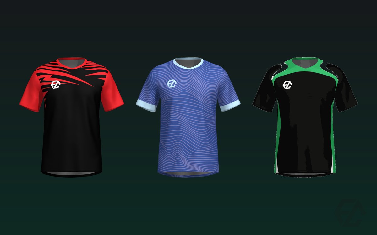
A kit's colours aren't just aesthetics: they tell a story and project an attitude. Choosing your club's palette well strengthens its identity; choosing badly condemns your players to a jersey nobody feels is theirs.
What each colour conveys
This isn't mysticism: these are cultural associations that have been settled in football for decades.
- Red: passion, aggression, energy. It intimidates. It's the colour of teams that want to impose themselves from the first minute.
- Blue: confidence, calm, tradition. The most common among clubs with history.
- Black: elegance, strength, authority. It works very well on away kits and suits almost any accent colour.
- White: purity, classicism, cleanness. It demands that the rest of the design brings the character.
- Green: freshness, local identity, nature. Widely used by clubs tied to their home turf.
- Yellow: optimism, visibility, joy. The most visible on the pitch, which is no small detail.
How to choose your club's palette
Start from your history, not your tastes. The colours of the town, the neighbourhood, the local flag or the club's founding colours are the natural starting point — and they have a practical advantage too: nobody argues about them at the AGM.
Then, the rule that almost never fails: one main colour and one or two supporting ones. Fewer colours almost always looks more professional. The kits that fail tend to be the ones trying to squeeze in four colours so nobody gets upset.
Contrast for the number: the detail everyone forgets
Remember that the name and number have to be readable from the stands. A numbering colour that contrasts with the jersey matters as much as the overall palette, and it's where the most beautiful kits get spoiled.
Classic disaster cases: a yellow number on a white jersey, a black number on a dark all-over, or thin numerals on a busy pattern. If in doubt, go white on dark or black on light: dull to describe, perfect to read.
The crest rules
A frequent mistake: choosing the jersey colour and then discovering the crest disappears on top of it. If your crest is navy, a navy jersey will swallow it whole.
Choose the colour with the crest in mind, not the other way round, or have a version of the crest with a border ready for backgrounds that camouflage it. We go into it in how to design your club's crest.
Home and away kits
The away kit usually inverts or varies the palette to avoid clashing with the opposition: if you play in blue, the away kit can't be light blue.
It's also a good opportunity to be bold with a secondary colour you wouldn't use on the home kit. Many clubs discover an alternative identity there that ends up better loved than the main one. And since we make on demand with no minimum order, having two kits doesn't mean doubling stock: you order what you need.
Colours across the rest of the kit
Think about the whole, not just the jersey. The shorts and socks can match (sublimated) or come in a neutral colour that lets the design breathe. Sometimes, plain black shorts make a busy jersey look twice as good. We compare the options in sublimated or basic shorts.
Try it before deciding
Theory is fine, but the eye decides. Go into the customiser, upload your club's crest and flick through the colours on the real models. In two minutes you'll see which combination works and which doesn't, with no sign-up and no quote needed.