Football jersey design trends for 2026
Gradients, all-over patterns, the retro comeback and the colours that will dominate the season.
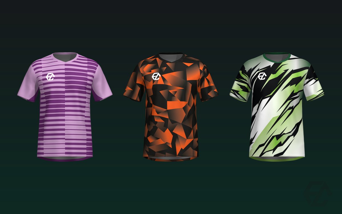
Every season brings new fashions to kits. These are the design trends for 2026 we're seeing at clubs of every level, and how to apply them without your jersey looking like a passing fad in two years' time.
Gradients and all-over prints
Sublimation has set design free. Colour gradients, textures and patterns covering the whole jersey seam to seam (known as all-over) are the stars of 2026.
What used to be impossible with vinyl — because every colour was another layer stuck on top of the fabric — now prints without limits and without adding a single gram of weight. A gradient sweeping diagonally across the jersey costs no more than a plain colour.
Practical tip: if you go for a busy all-over, leave a clean zone for the crest and the number. A pattern that competes with the number looks lovely on the hanger and is a disaster from the stands.
The retro comeback
Classic stripes, polo collars and 90s palettes are back in force. Mixing a modern cut with a retro nod works especially well: current technical fabric, a fitted silhouette and a pattern that recalls the jersey the club president grew up with.
It's also a trend that ages well. A retro design will still look intentional in three years; a hyper-modern one, not necessarily.
Fluoro colours and contrasts
Vivid tones (coral, turquoise, fuchsia, mint green) are gaining ground on the classic red-and-blue, above all in away kits and goalkeeper shirts, where there's more freedom because the club's historic colours don't have to be respected.
The away kit is the perfect place to be daring: it has to stand apart from the opposition, it gets worn less and nobody expects it to be sacred.
High contrast between design and numbering
Less glamorous but very real: after a few years of jerseys where the number was barely readable, high contrast is back. Big numbers, clean typography and a colour that stands out from the background.
It makes sense: the jersey is workwear. If the referee can't see your number, the design has failed, however pretty it is.
Total customisation
The big underlying trend isn't a colour or a pattern: it's that every club wants something unique. The closed catalogue of three models where you pick the least objectionable one no longer cuts it. Clubs want to choose the model, colours, pattern and details, and see the result before committing.
That's why the real-time customiser has become essential, and why on-demand production with no minimum order has stopped being a luxury: it lets a neighbourhood club have a kit as much its own as a professional side's.
How to choose without regretting it in January
Trends are fine, but a kit is worn all season and, often, two. Three criteria that never fail:
- Respect the club's colours. Fashion passes; identity doesn't. Apply the trend within your palette, not instead of it.
- Think about the team photo. It's the image that will endure. If the design only works up close, it doesn't work.
- Check the legibility of the crest and the number before approving.
We help you with that last one in the meaning of colours and in how to design your club's crest.
See it on our models
Take a look at the model catalogue and see which ones follow these trends: there are all-over prints, gradients, retro looks and fluoro palettes. Upload your crest in the customiser and check how it looks in your club's colours before deciding anything.